
Product · Overview
Each brand's last 30 days, in one line
Open a brand and read the story first: what sales did, what the ads cost, and what every ₹1 of ads brought back. The numbers, the chart and the reasons sit right under it.
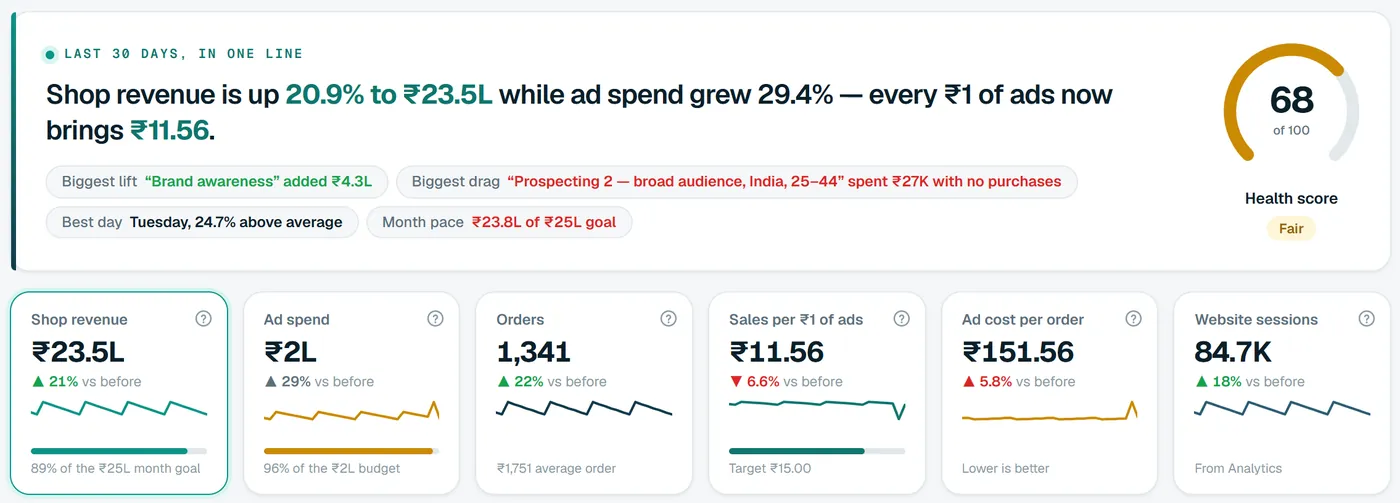
The summary line
The story before the spreadsheet
“Shop revenue is up 20.9% to ₹23.5L while ad spend grew 29.4%, and every ₹1 of ads now brings ₹11.56.” Moatrics writes that sentence from your numbers every morning, and colours what went well and what needs a look.
- Biggest lift and biggest drag: the campaign that added the most, and the one that spent without selling.
- Best day of the week, and how far above average it sells.
- Month pace: where sales will land against your goal at today's rate.
Health score
One number for “are we OK?”
A score out of 100, in four equal parts: fresh data, the return on ads (against your target, once you set one), the sales trend (towards the month's goal, once you set one), and a week without alerts.
It isn't a grade to chase. It tells you where to look first, and pointing at it shows which part lost points.
Health score, sample store
Fair
Four parts, 25 points each.
- Data up to date25/25
4 of 4 sources fresh
- Return on ads19/25
₹11.56 of the ₹15.00 target
- Sales trend23/25
On course for ₹23.8L of ₹25L
- No alerts this week7/25
3 alerts in the last 7 days
The six cards
The numbers that answer most questions
Each card shows the total, the change against the period you compare with, a small trend, and what it's made of.
Shop revenue
What your store actually sold, with a bar towards the month's goal.
Shopify, or Google Analytics
Ad spend
Meta Ads and Google Ads together, with a bar towards the month's budget.
Meta Ads + Google Ads
Orders
Real orders from your store, and the average order value under it.
Shopify
Sales per ₹1 of ads
Sales divided by ad spend for the same days, also called MER or ROAS.
Store sales ÷ ad spend
Ad cost per order
Ad spend divided by real store orders, not by the platforms' own conversions.
Ad spend ÷ store orders
Website sessions
Visits to your site, to see whether more traffic came with the spend.
Google Analytics 4
Compare
Against the days before, last year, or any dates
Pick the dates, then pick what they're measured against. The summary, the cards and the chart all update together.
- 7 days, 30 days, this month, or your own dates.
- Ranges end yesterday, in your organization's timezone, so a half-finished today never drags the numbers down.
- Every change on the page follows what you compare with.
Dates
Compared with
30 Aug – 28 Sept vs 31 Jul – 29 Aug
Shop revenue ▲ 21% · Ad spend ▲ 29%
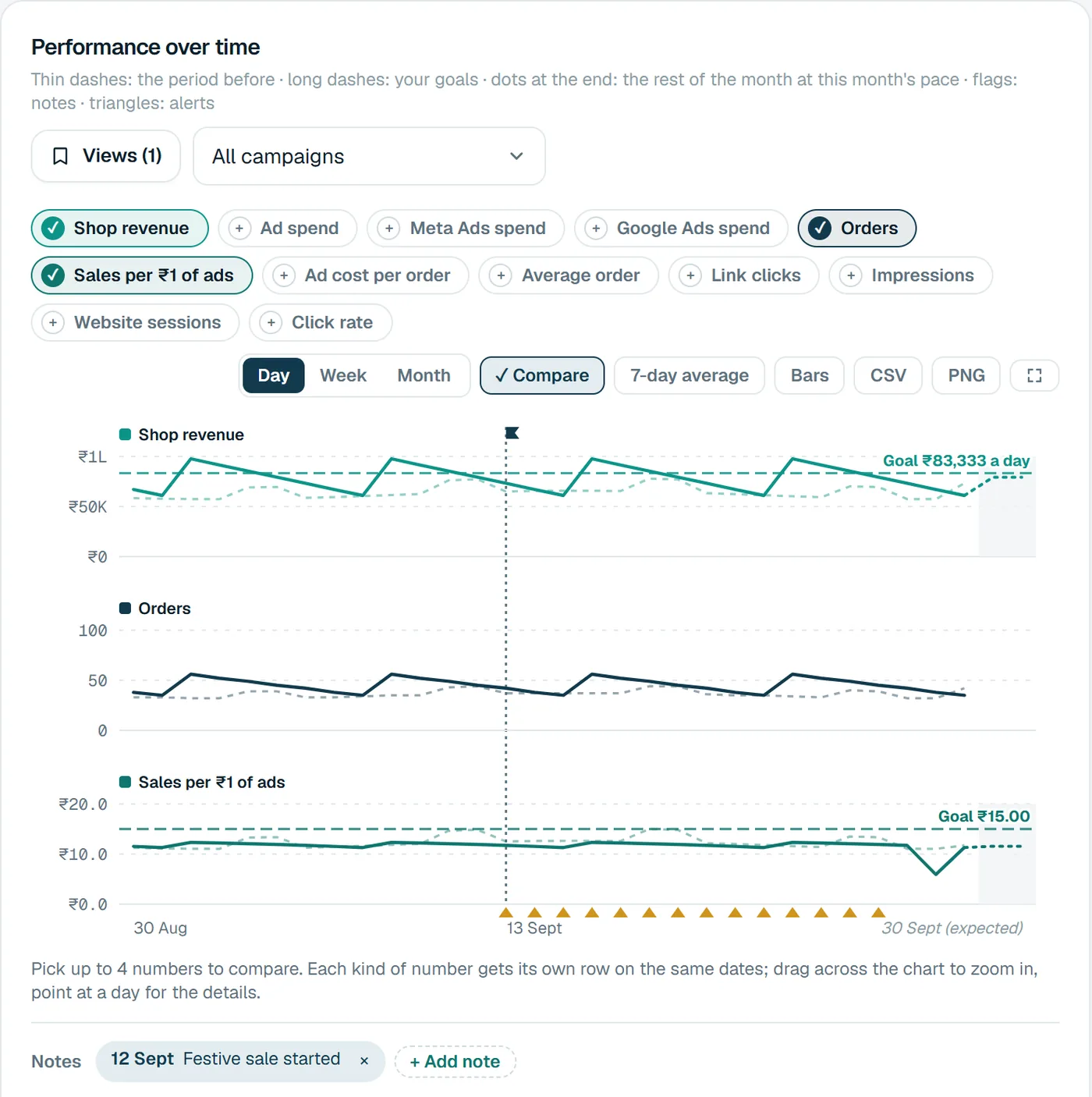
Performance over time
A chart that explains itself
Pick up to four numbers. Each kind gets its own row on the same dates, so revenue and orders never fight for one axis. Drag across it to zoom in, and point at a day for the details.
- Solid line: the dates you picked
- Thin dashes: the period you compare with
- Long dashes: your goal for the day
- Dots at the end: the rest of the month at this month's pace
- Flags: your notes, like “Festive sale started”
- Triangles: days an alert fired
Switch to one campaign, group by week or month, smooth it with a 7-day average, or download it as CSV or PNG. Save the view you use most.
What changed
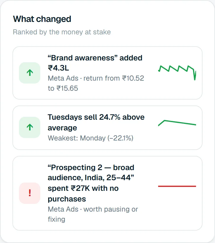
The changes worth your time, ranked by money
Instead of scanning every campaign, read the few that moved the money, each with a one-line reason.
- Campaigns that added the most, with their return before and after.
- The day of the week that sells best, and the weakest.
- Campaigns spending without purchases: worth pausing or fixing.
Questions
About the overview
Bring your brands into one dashboard
Moatrics is in early access for brands and agencies. Tell us how many brands you run and which platforms you use, and we'll set you up.